1.Gap
In 2010, Gap unveiled a new logo featuring a Helvetica font and a blue square. The logo was met with severe backlash from customers and designers, who criticized it for being bland and unoriginal. Within a week, Gap reverted to its original logo, admitting that the new design was a mistake.

2.Tropicana
In 2009, Tropicana decided to rebrand its logo and packaging to give it a more modern and clean look. However, the new design was met with confusion from customers, who had trouble finding the brand on store shelves. Sales dropped by 20%, and the company eventually reverted to its original packaging.

3.Uber
In 2018, Uber unveiled a new logo featuring a geometric design with a bright blue color scheme. The new design was meant to reflect the company’s shift towards becoming a more mature and sophisticated brand. However, customers and designers criticized the logo for being too abstract and difficult to read. The company eventually made some adjustments to the design, but the damage was already done.

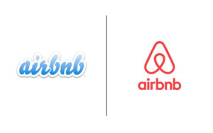
4. Airbnb
In 2014, Airbnb unveiled a new logo featuring a geometric design meant to reflect the company’s global reach and community spirit. However, the logo was met with confusion and criticism from customers, who compared it to various body parts and objects. The company eventually tweaked the logo but it was too late.

5. The University of California
In 2012, the University of California underwent a rebranding effort to create a new visual identity. The new logo featured a monogram of a stylized “U” and a “C” that resembled a fruit bowl, which was met with widespread criticism and ridicule from alumni, faculty, and students. The university eventually scrapped the logo and reverted to its original design.
In conclusion, logo rebranding is a significant decision that should not be taken lightly. A poorly designed logo can damage a brand’s reputation and image, resulting in lost revenue and customer loyalty. It’s crucial to hire a professional company with expertise in logo design and branding to ensure that the new design accurately reflects the brand’s identity and values. A professional company can also conduct market research to understand the target audience and competition, ensuring that the logo resonates with customers and stands out in a crowded market. So, before deciding on a logo rebrand, invest in the right resources to ensure a successful outcome.


 Team of Graphic Designers
 Team of Graphic Designers
